YMS by One Fifteen
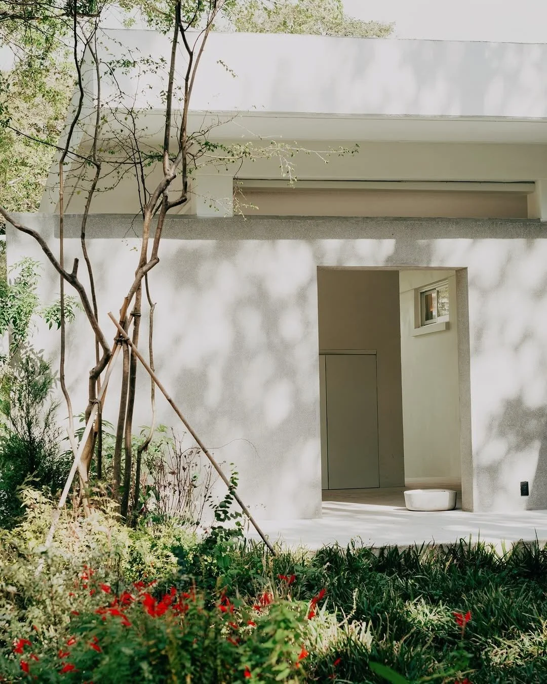
Nestled within Shanzaihou, one of Yangmingshan's five historic quarters, H-2 is a new lifestyle destination built on a remarkable past. The site was once an American military housing complex — constructed between the 1950s and 60s to house the highest-ranking US officials stationed in Taiwan, and deliberately designed to echo the ease and familiarity of suburban American life. Working alongside OnBrand on brand strategy, we developed a brand identity that honours this layered history while reimagining H-2 as a destination for contemporary living and leisure.
Client
One Fifteen
Year
2024
Discipline
Precinct Identity
Collaborators
Project undertaken with OnBrand
Photos
Lili & YMS
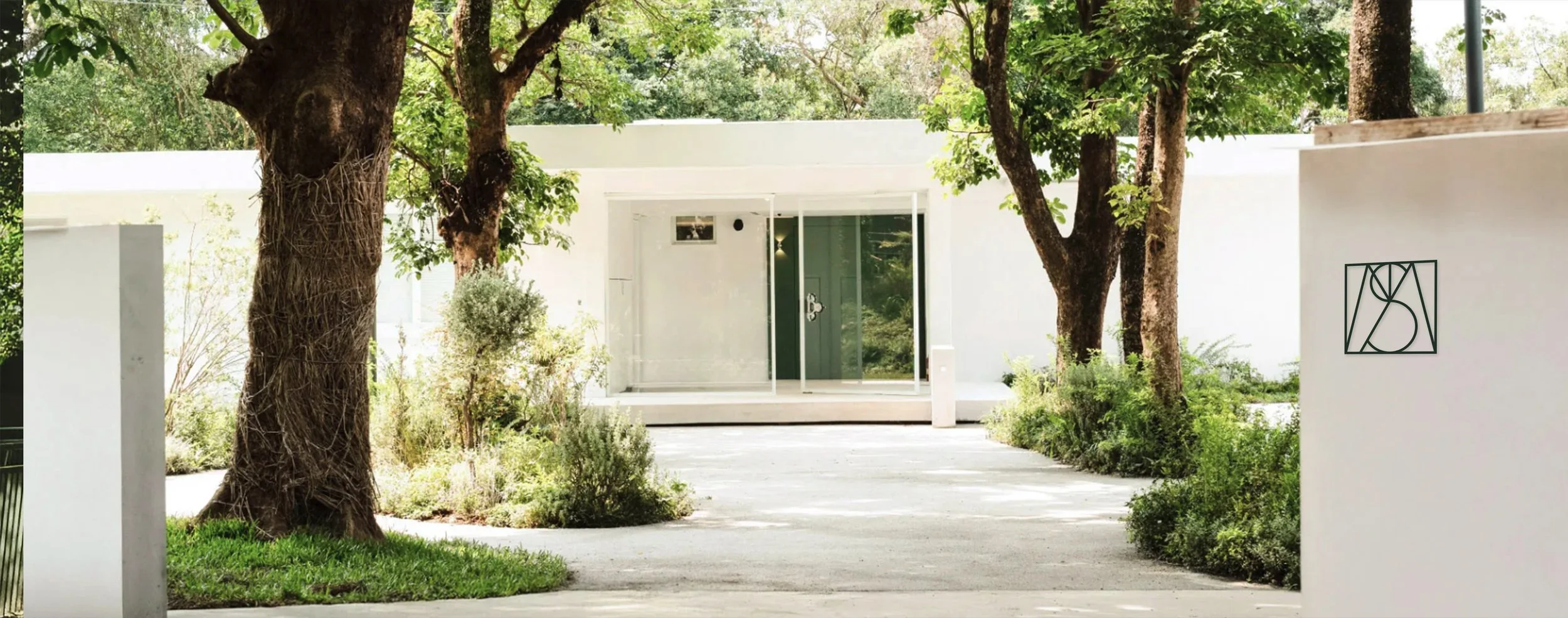
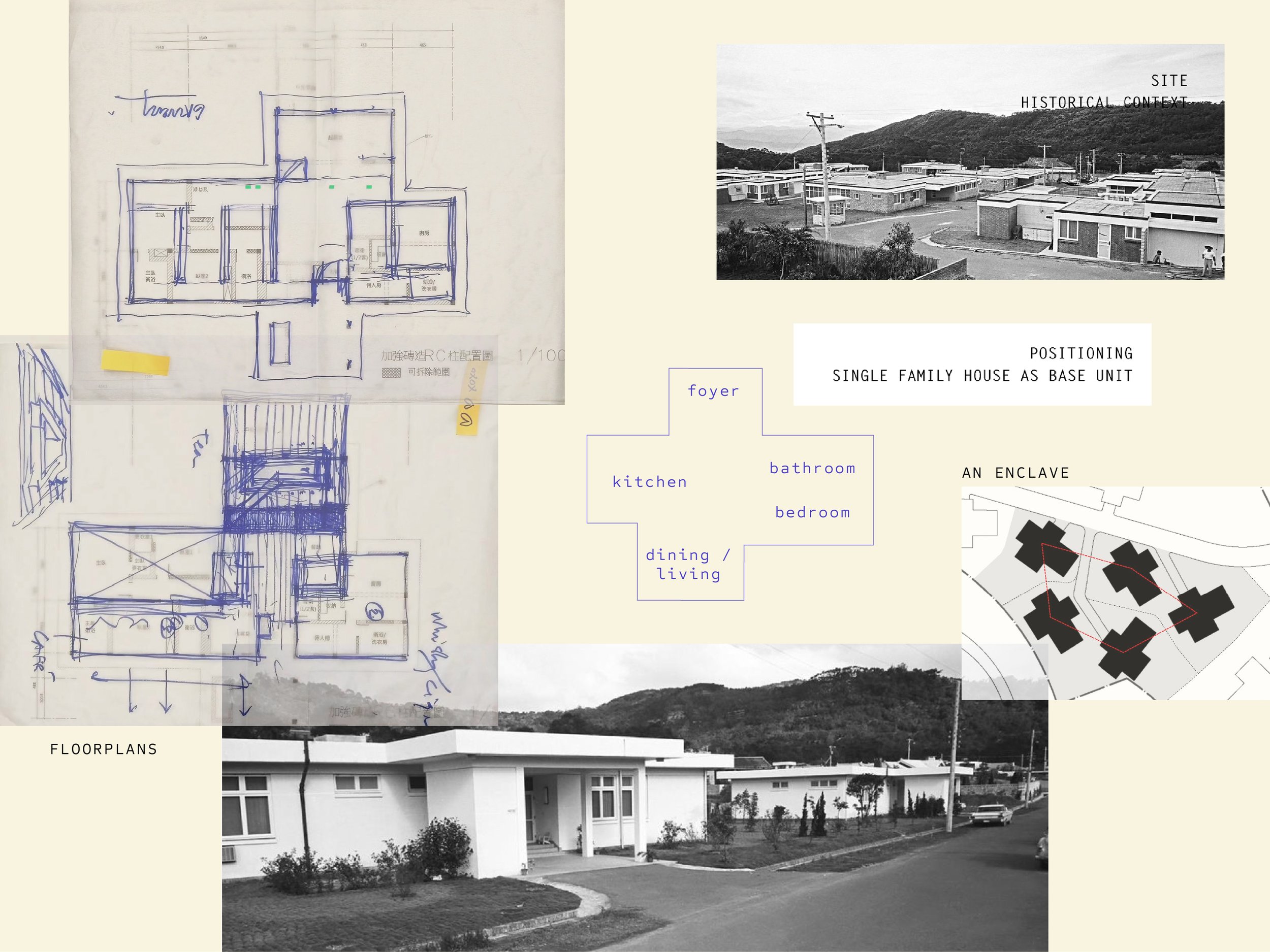
“It was as if an entire American town had been transplanted to Yangmingshan.”
Located in one of Yangmingshan’s five quarters in Shanzaihou is H-2 quarter- the historical American Military Housing Complex built between the 1950s and 1960s. It was home to the highest ranking officials in the US military, intentionally built to recreate a suburbia town, and a leisurely lifestyle for the residences. With the history, background, space, and landscape, onefifteen has acquired the H-2 quarter, intending to repurpose it into a new lifestyle destination.
Quiet is making everything more clear.
Laila Fan, Founder Soundscape Association of Taiwan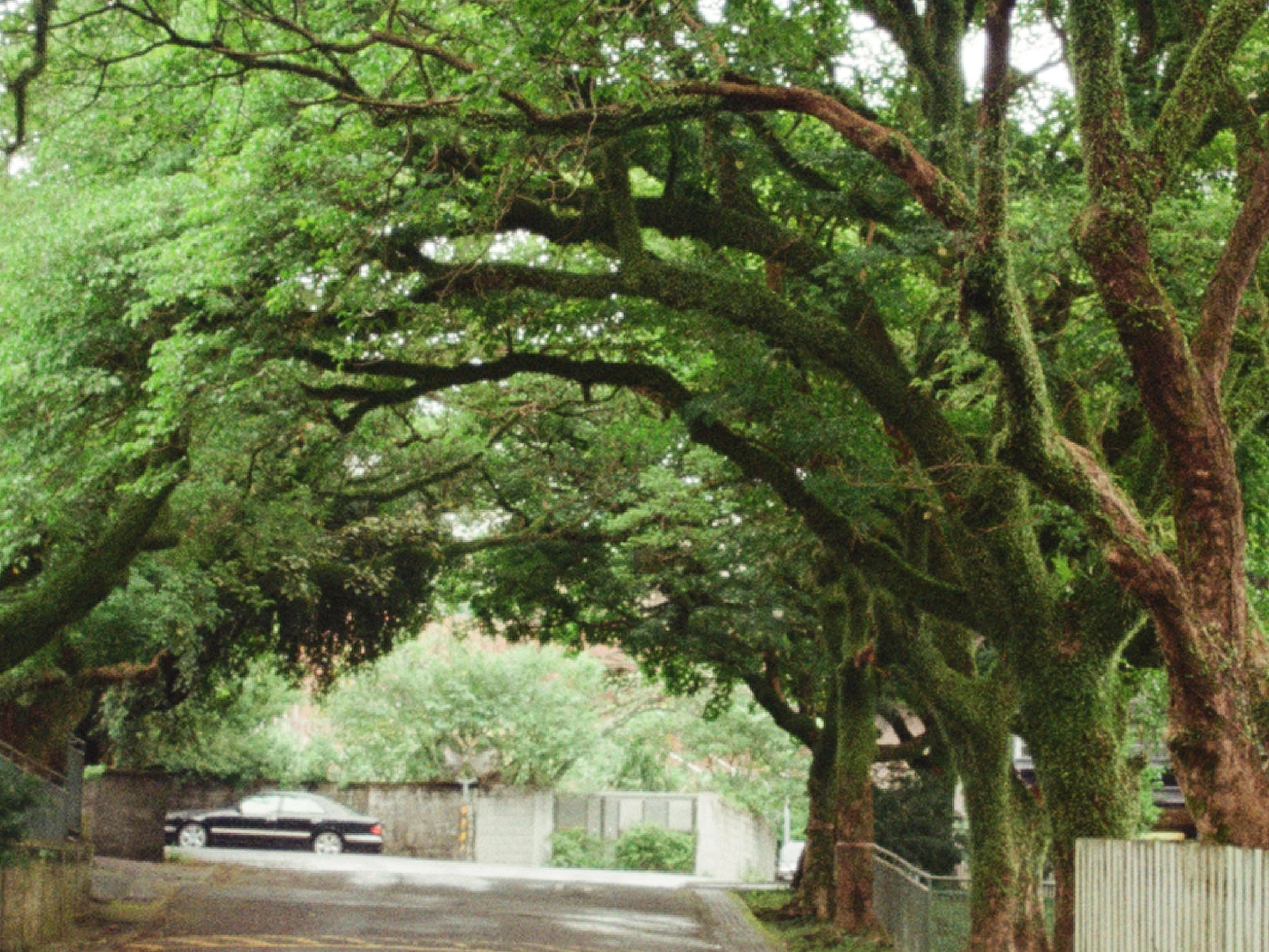
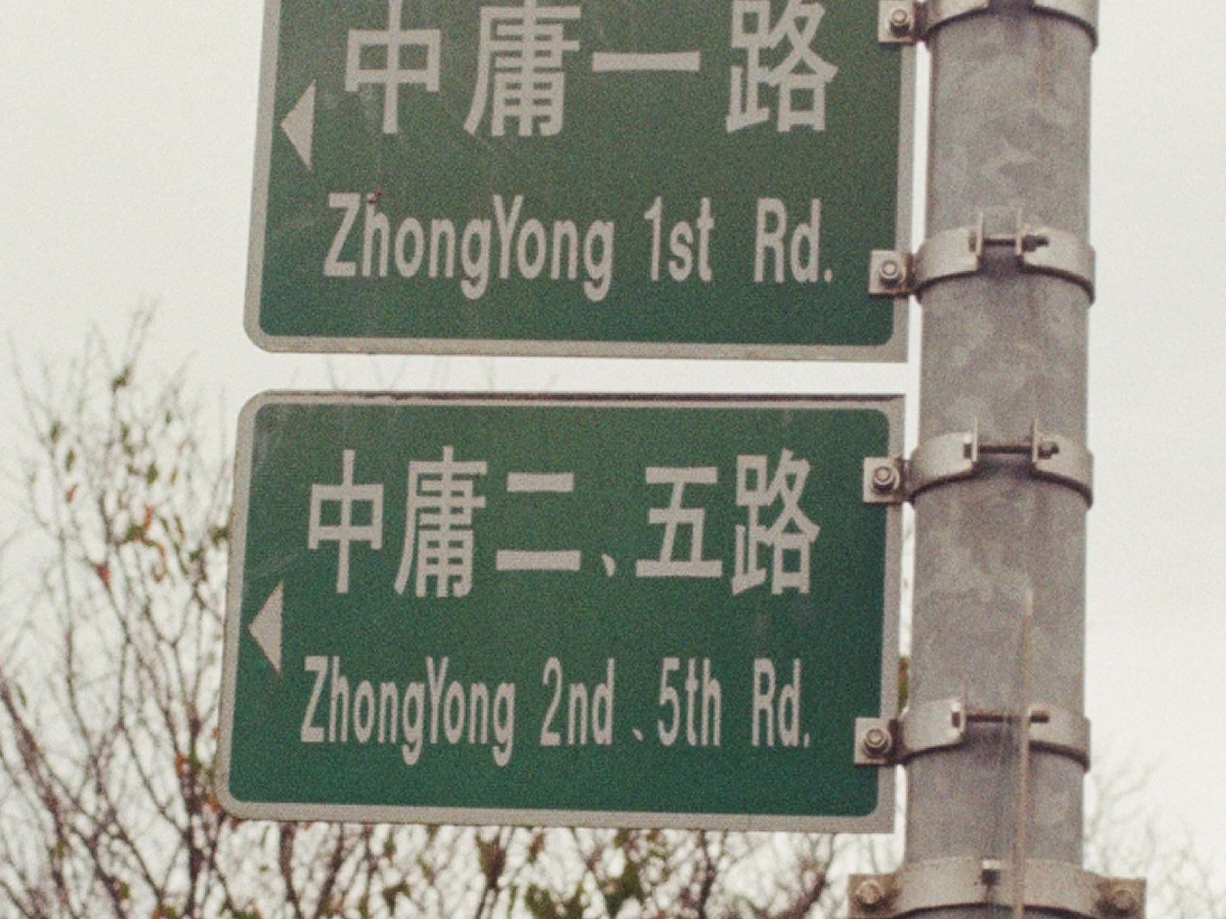
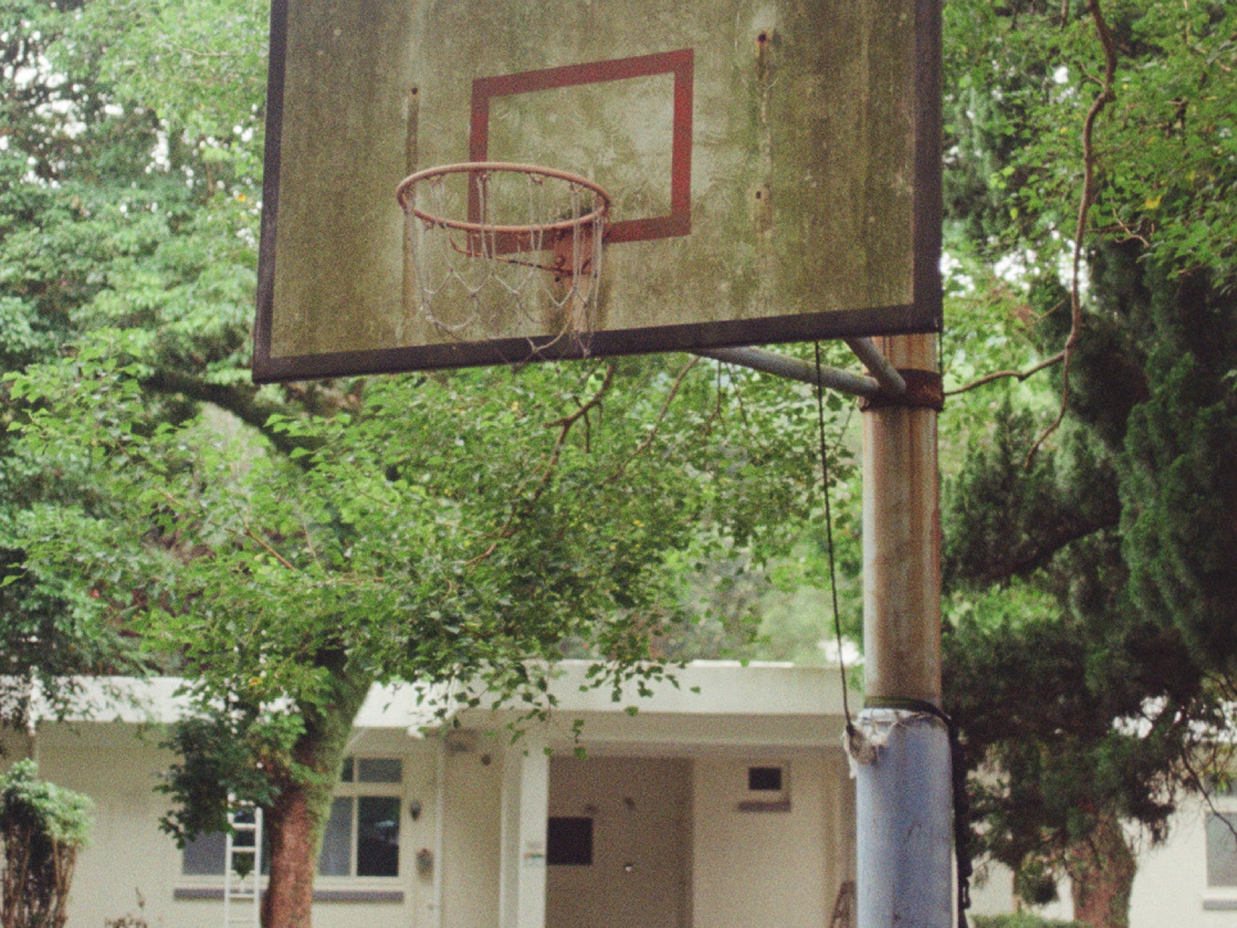
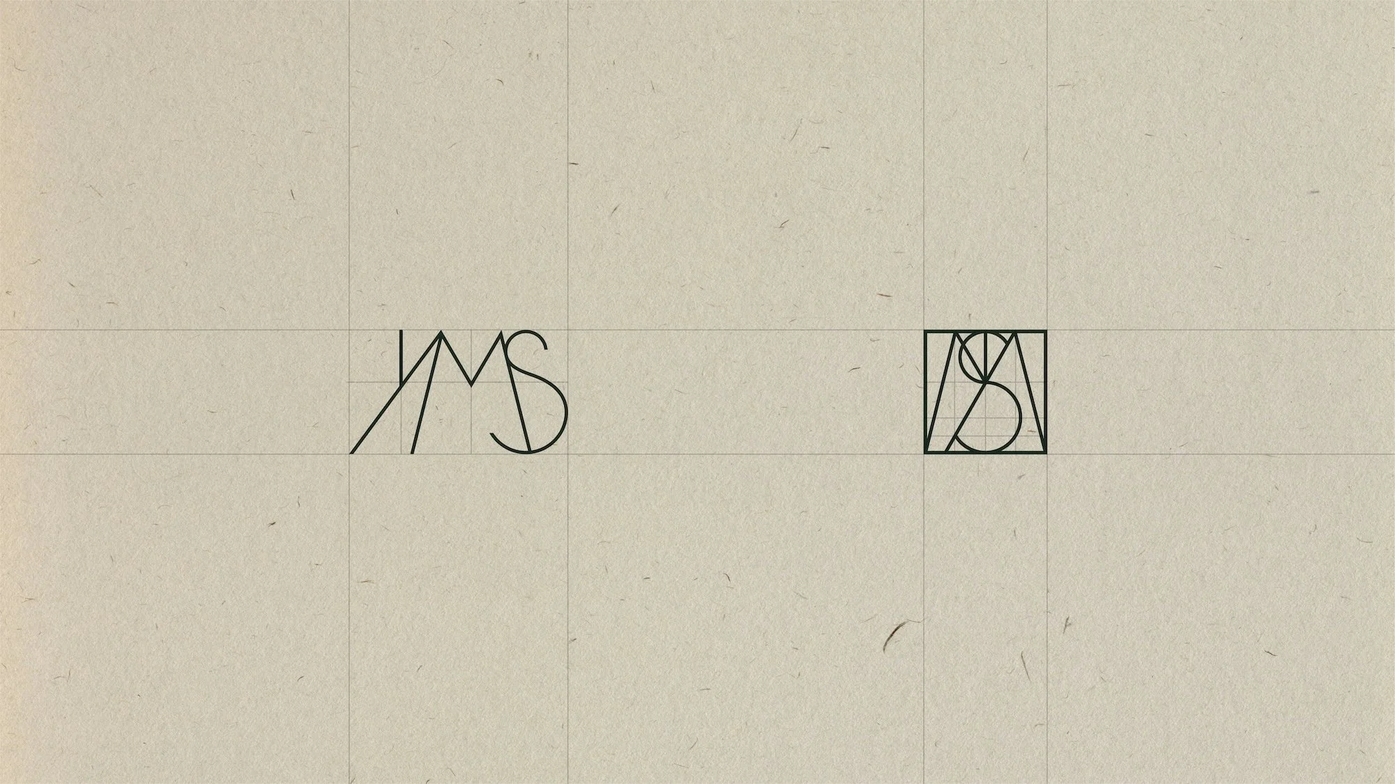
The identity is built on a bespoke grid system inspired by the architectural cross-section of the buildings themselves — a structural framework that becomes a symbol of the intersection of cultures, ideas, innovation, and expression that YMS stands for. From this grid, a custom logotype was drawn, with the letters 'YMS' engineered as individual emblems that unite into a singular mark.
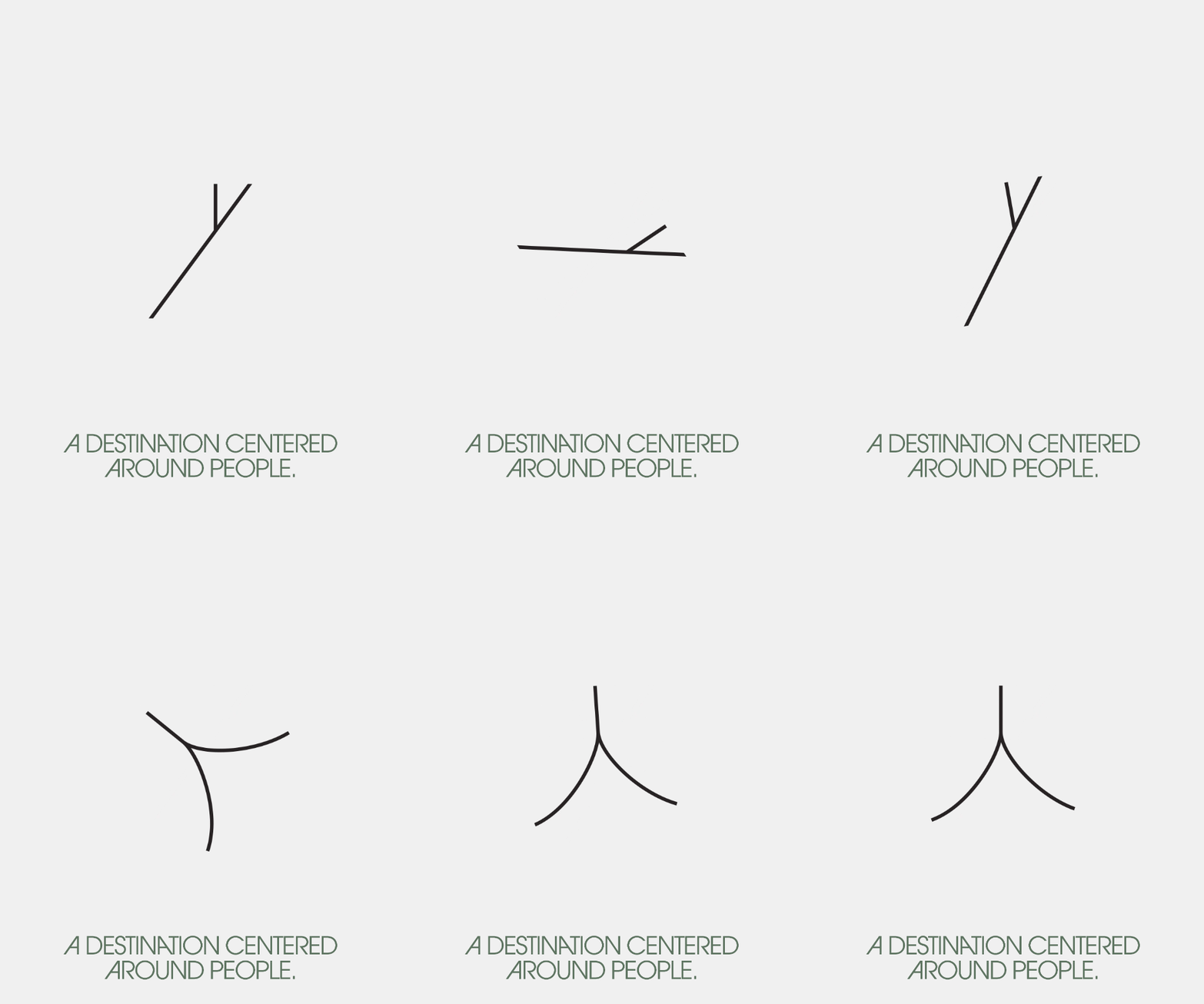
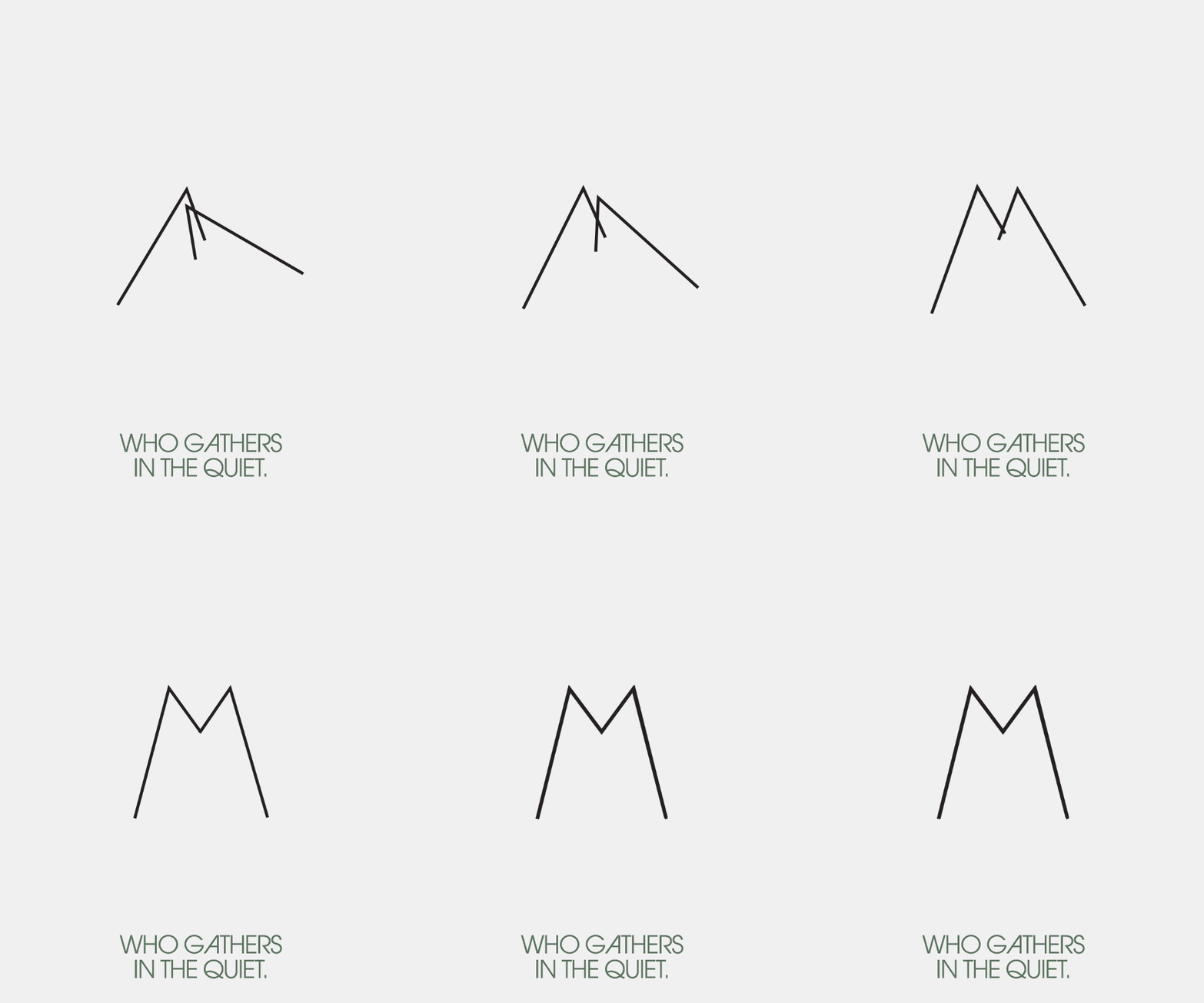
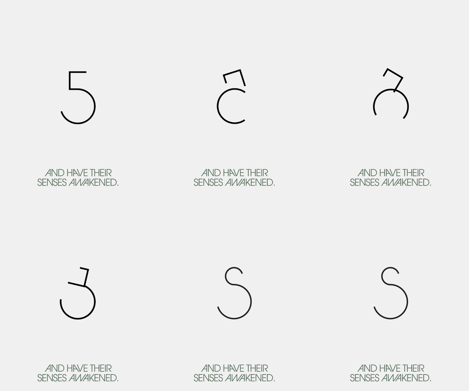
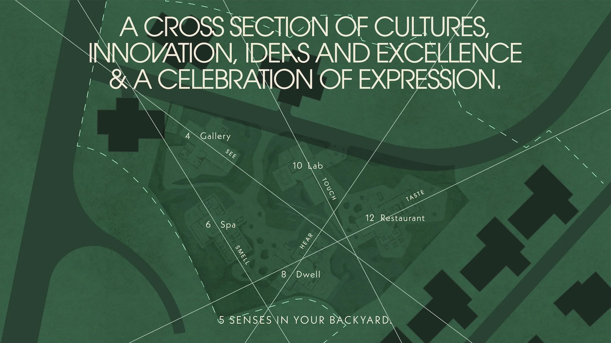
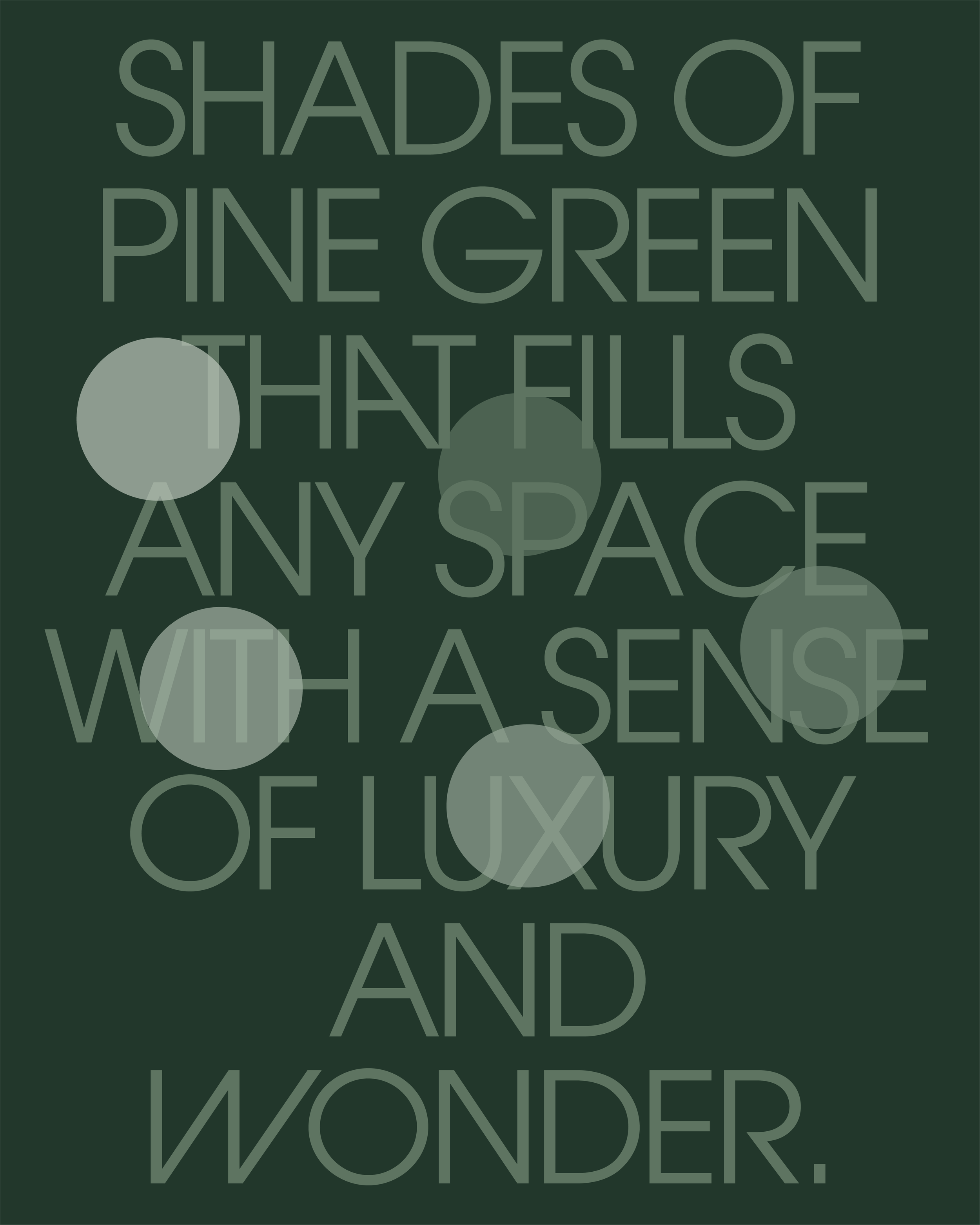
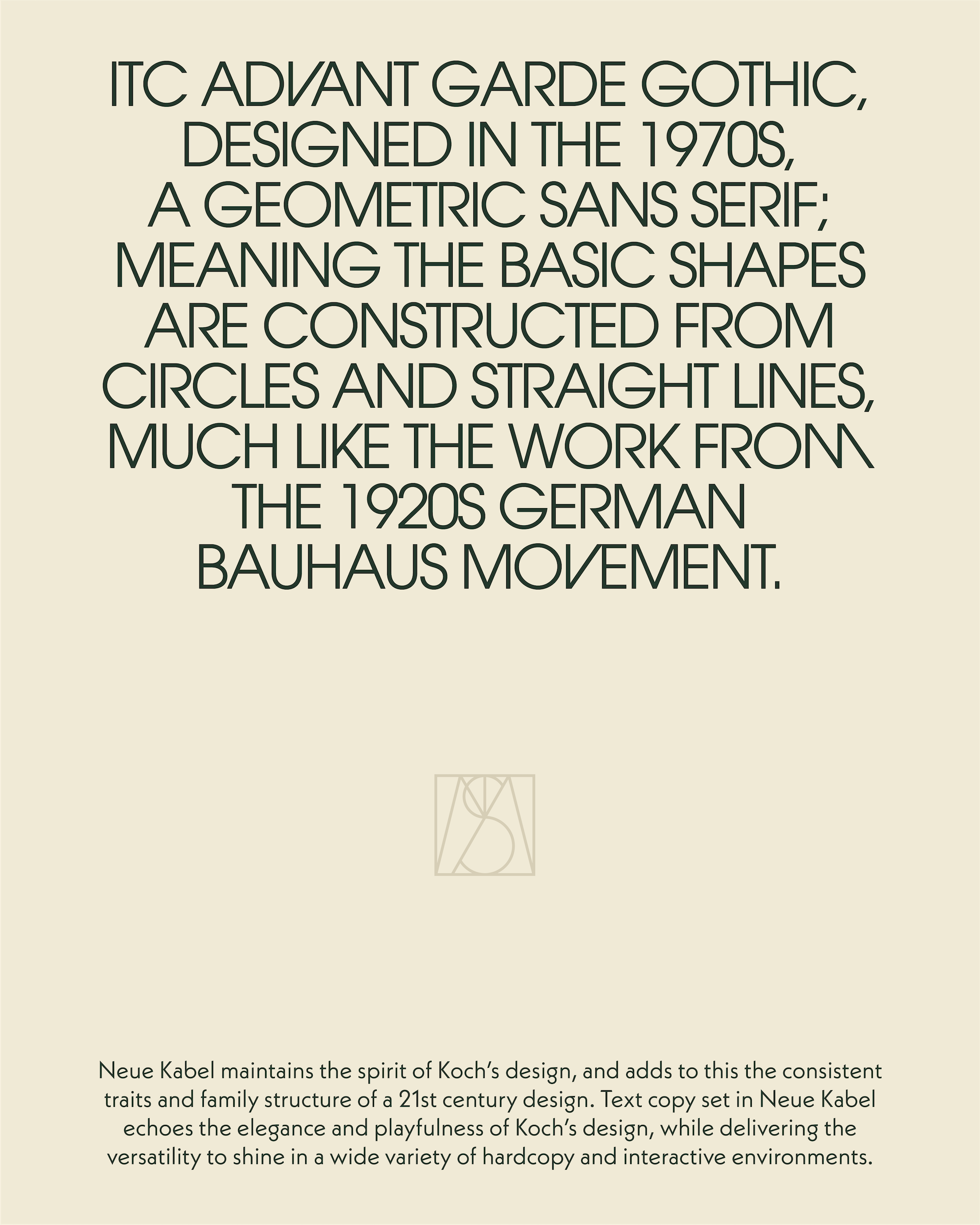
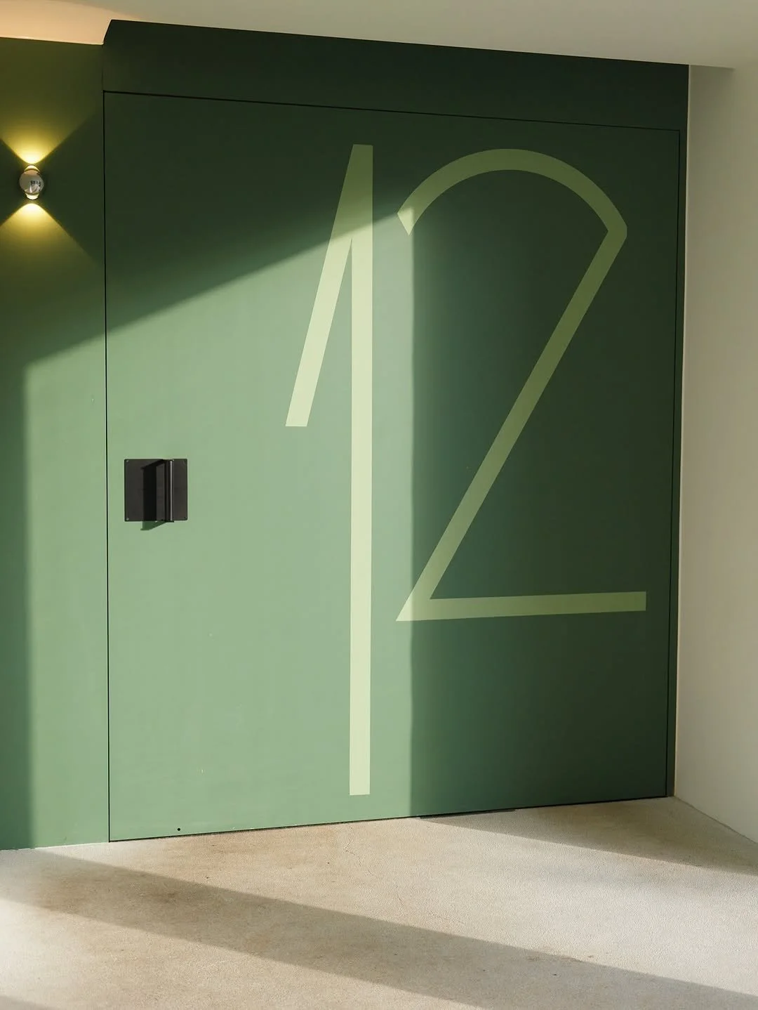
The grid extends beyond the logo into a series of sub-marks, each corresponding to a block number — a nod to the original letterbox numbering of every home in the complex. Colour follows the same logic: a palette of pine greens drawn from the landscape, with each distinct shade assigned to its respective block, giving every unit its own identity within the whole. For typography, ITC Avant Garde Gothic anchors the system — a geometric sans-serif from the 1970s whose forms are constructed from circles and straight lines, echoing the rationalist spirit of the Bauhaus movement of the 1920s. It is a quiet but deliberate reference to the modernist ideals that shaped both the typeface and the era that built H-2. Neue Kabel serves as the secondary typeface, complementing the geometry with warmth and legibility.