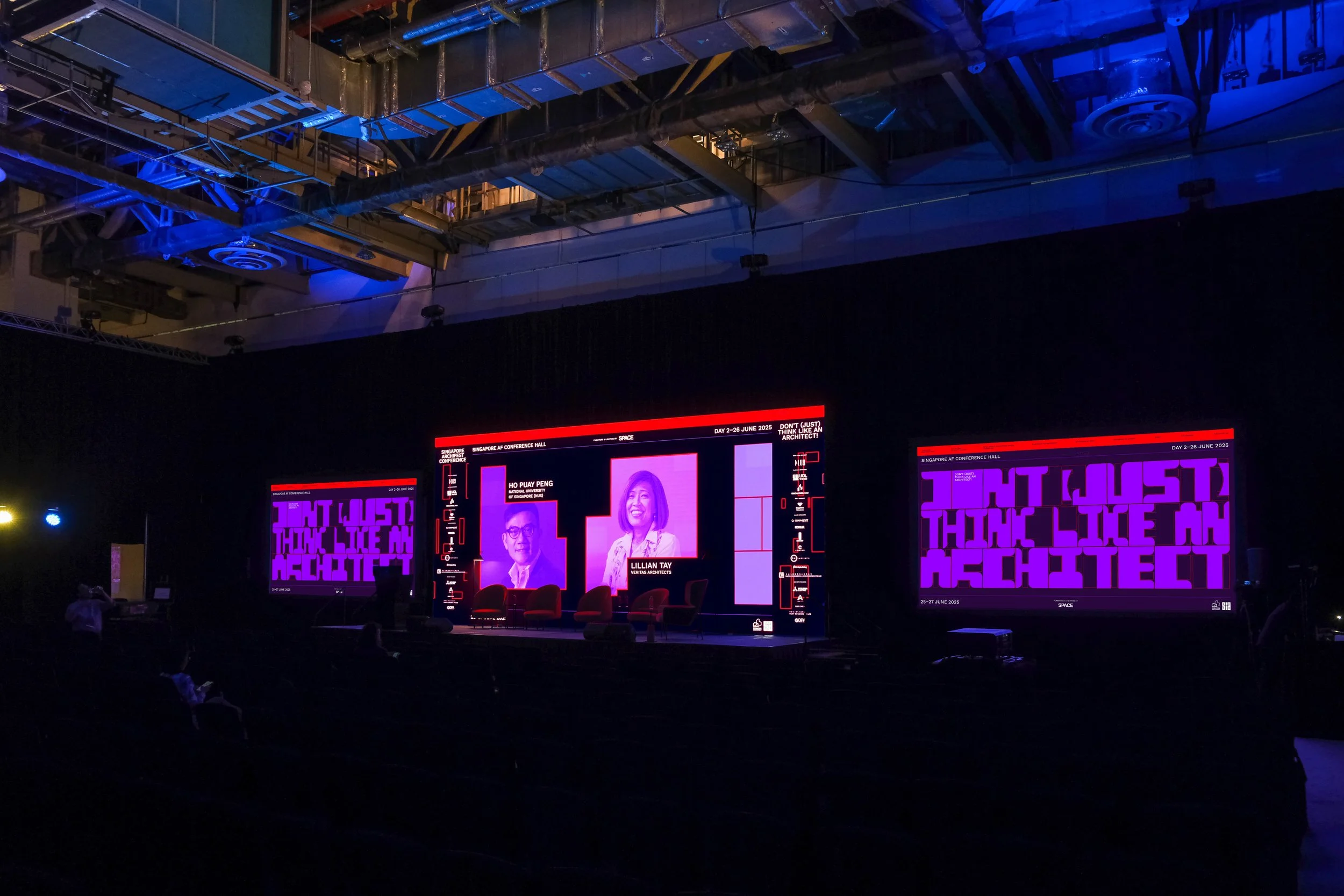
Singapore Archifest 2025
Commissioned by the Singapore Institute of Architects and curated by RT+Q Architects, Apause Studio developed the full visual identity and branding for Singapore Archifest 2025, themed 'Don’t Just Think Like an Architect!'.
The identity system plays with creative friction—modular typography meets abstract forms, while a bold red–purple palette reflects the festival’s call to rethink boundaries in design. The visual language was built to provoke, not just represent.
Client
Singapore Institute of Architecture
Year
2025
Discipline
Festival Identity, Website Design, Environmental Graphics
Country
Singapore
Collaborators
Joo Chiat Photos by Ong Chan Hao
“I want you to see familiar things differently.”
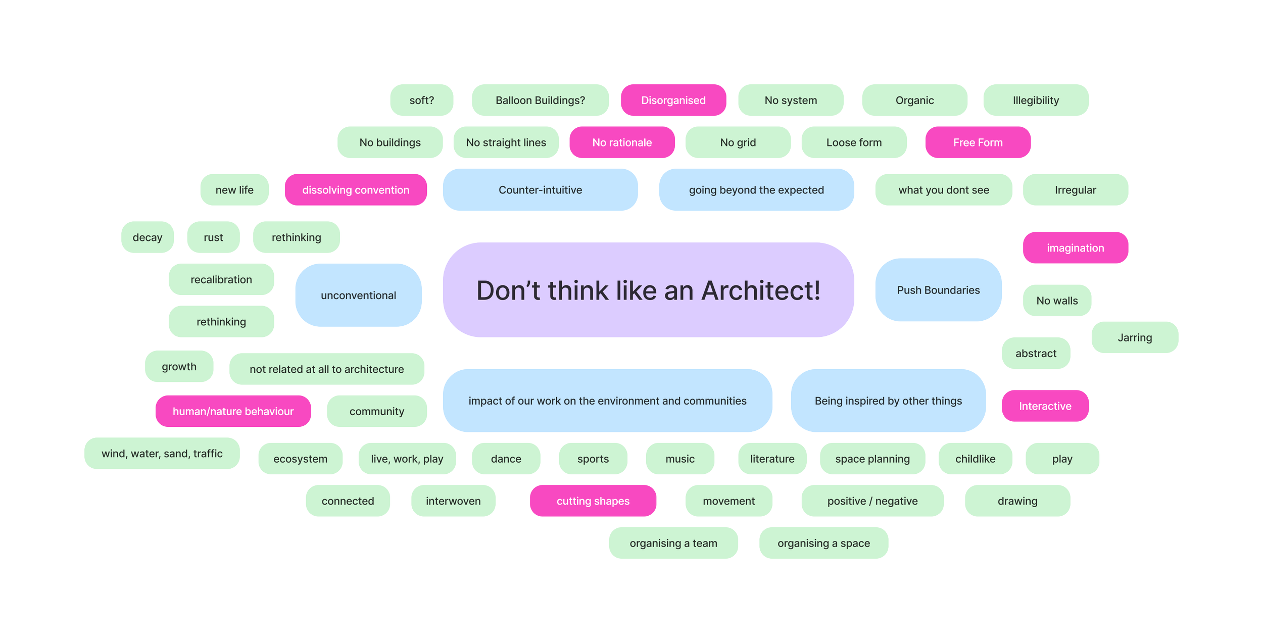
We didn’t want the visual identity to simply represent architecture. We wanted it to question it. To provoke. To play. To ask: what happens when something "wrong" enters the system, and remakes it?
It’s the tension between imagination and clarity. This is a deliberate play on counter-intuion: these forms shouldn’t fit, yet they do. They challenge what’s assumed to be fixed and propose that meaningful design emerges when we allow space for the unexpected.
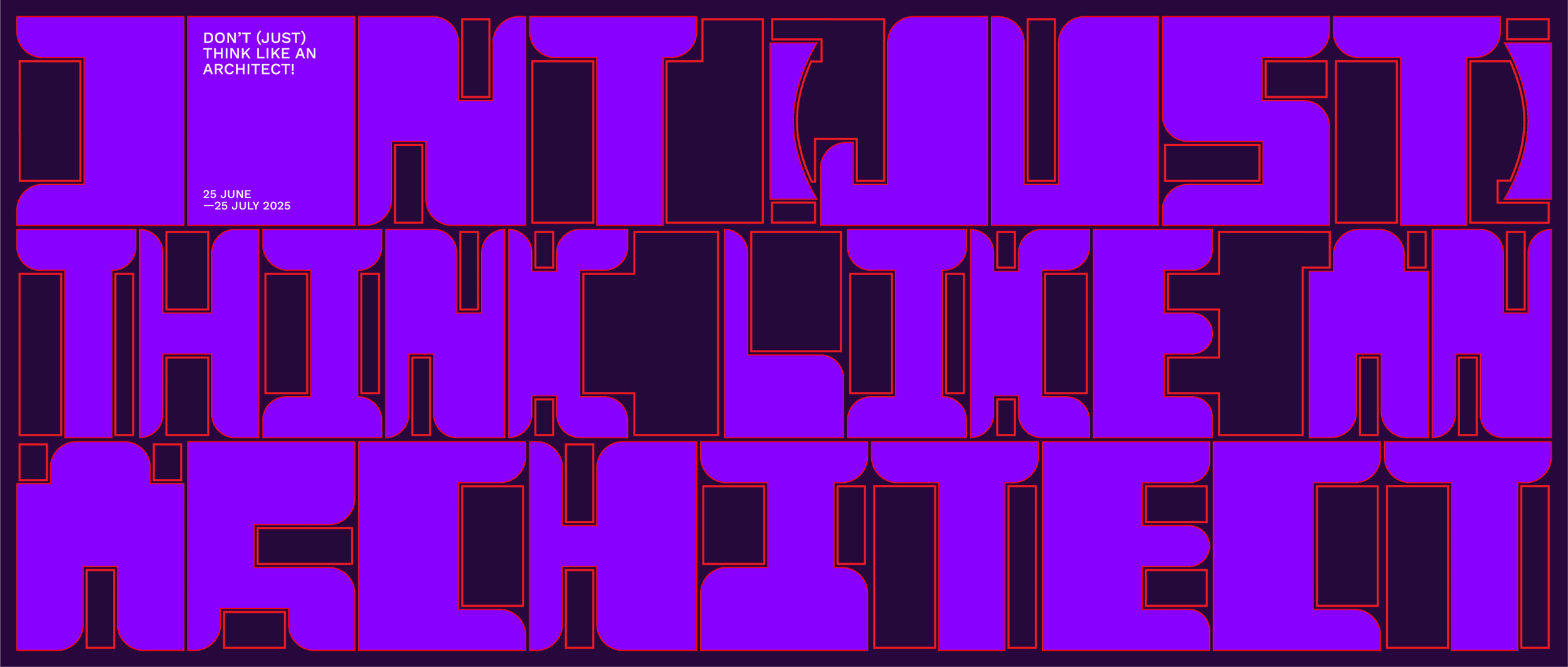
The most invenve ideas are born not from unlimited freedom, but from the tension between limitation and imagination. The zone of the unknown may feel uncomfortable—but it’s also where boundaries are pushed and breakthroughs happen. Visually, the palette of purple and red intensifies this disruptive energy. As opposites on the warm-cool spectrum, these colours create a tension that refuses to fade into the background.


From there this push and pull of the animation expanded into our brand language.
They mirror the festival’s call to rethink what architecture is and who gets to shape it.
This key visual isn’t just a graphic device—it’s a provocation. A reminder that architecture becomes most meaningful when we stop thinking only like architects and start thinking like explorers, problem-solvers, and risk-takers.