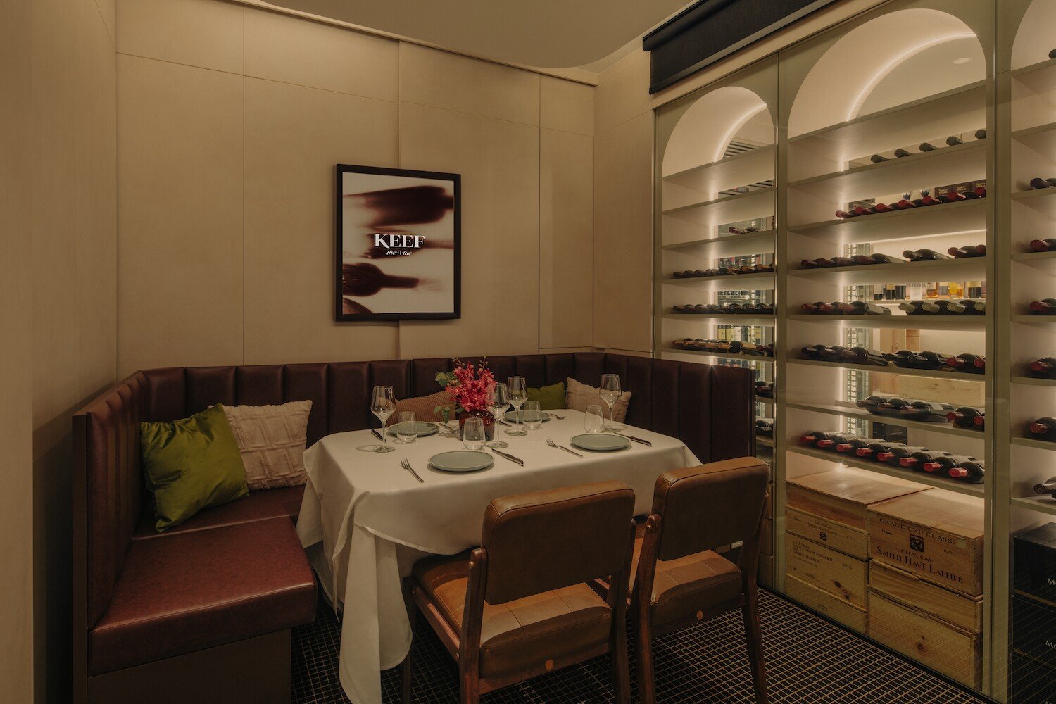
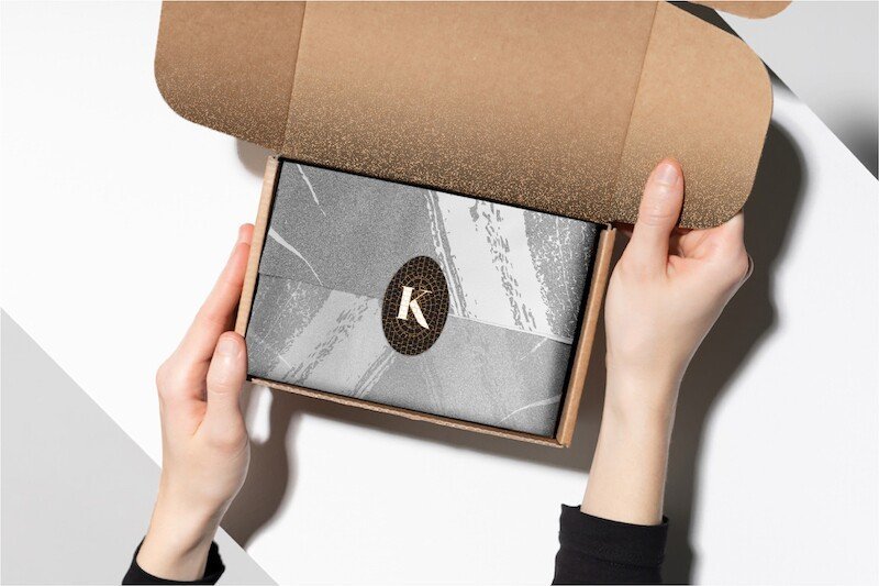
Rebranding a new and elevated Keef the Beef, set within a charming black and white colonial house in Rochester Park, Singapore. This project was a collaborative effort with FARM, who handled the interior design.
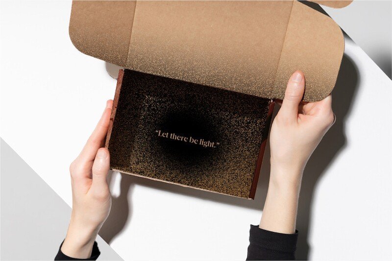
The rebranding of Keef the Beef centers on the restaurant being a “House of Light.” Just as light illuminates and warms, Keef seeks to nourish not only the body but also the mind and soul.
Keef the Beef
Client
Keef the Beef
Year
2021
Discipline
Brand Identity Refresh, Environmental Graphics
Country
Singapore
Collaboration
Project undertaken with FARM

The ChallengeRedesigning Keef the Beef's brand, with a goose icon chosen when Keef the Beef was born in the midst of the COVID lockdown, was the challenge. Our objective was to seamlessly weave this element into a revitalised identity for a steakhouse. With future plans to pivot into a michelin star restaurant.
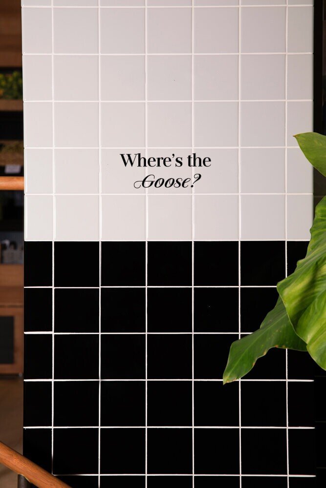
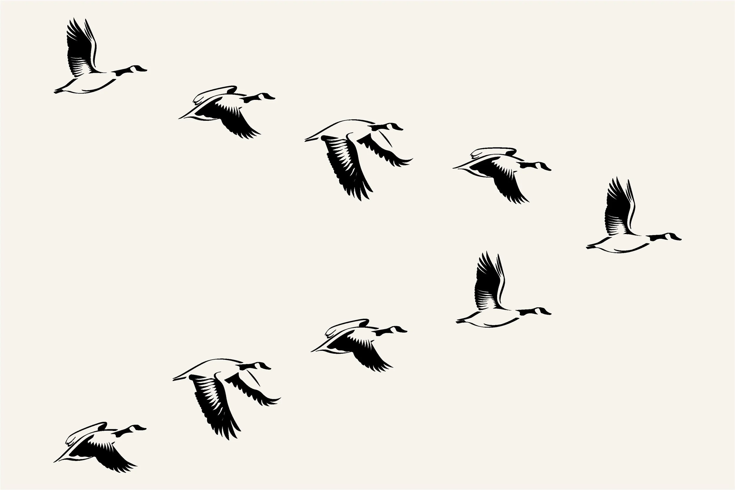
To achieve this, we crafted a symbol of rejuvenation: a flying goose symbol that embodies the essence of new beginnings. Our aim was to propel the new brand to great heights. Skilfully integrating subtle references to the old goose throughout the establishment, we created an engaging "wild goose chase" for our loyal patrons.

“Guided by the owners' Christian values and their desire to cultivate an inviting environment of happiness and unity, we envisioned the restaurant as an embodiment of positivity—a House of Light. This concept elegantly merged its spiritual significance with the fire used in the steak preparation.
A series of accompanying secondary graphics were created, inspired by the (technique) charring of the meat and (subject) marbling texture of the meat.”


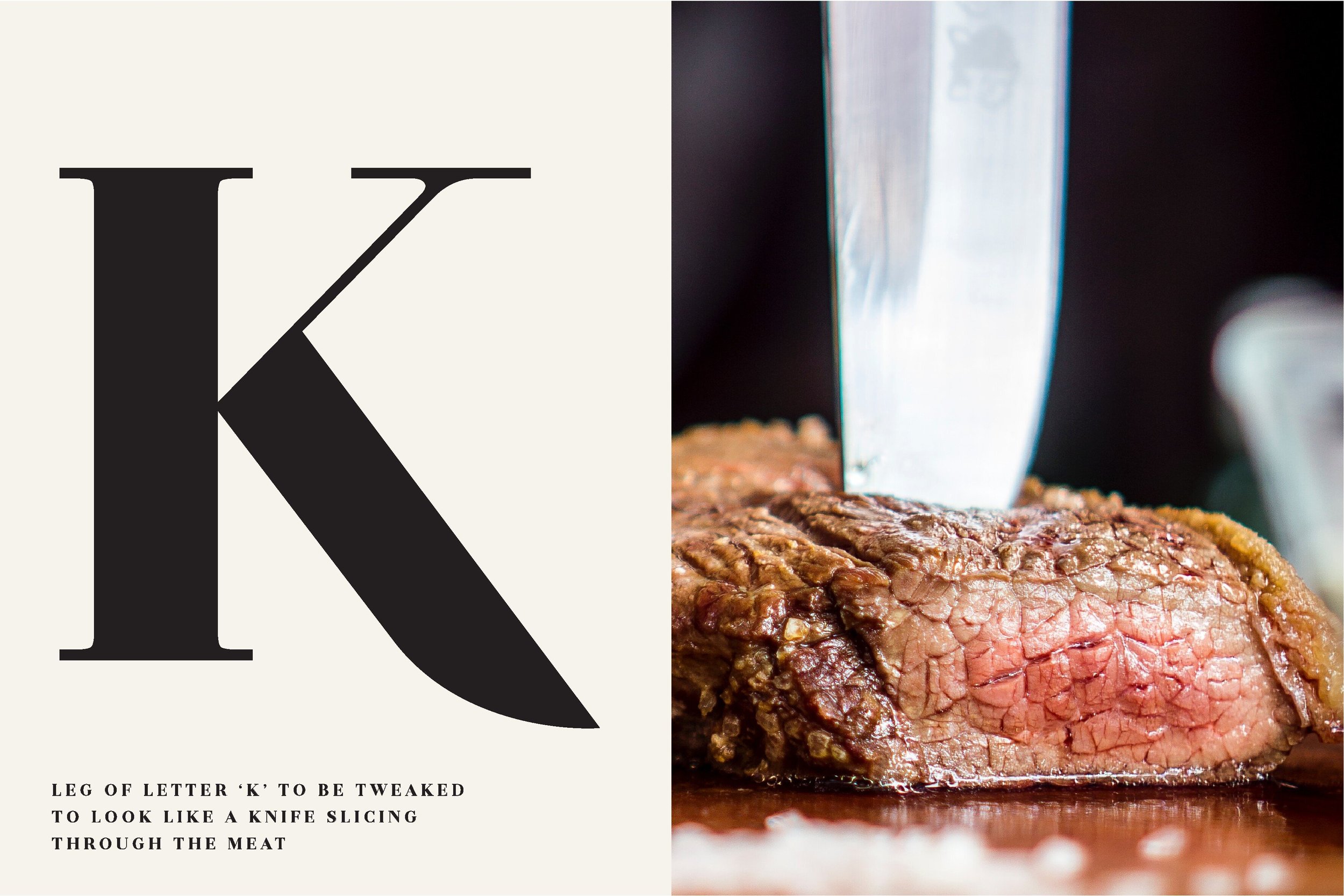
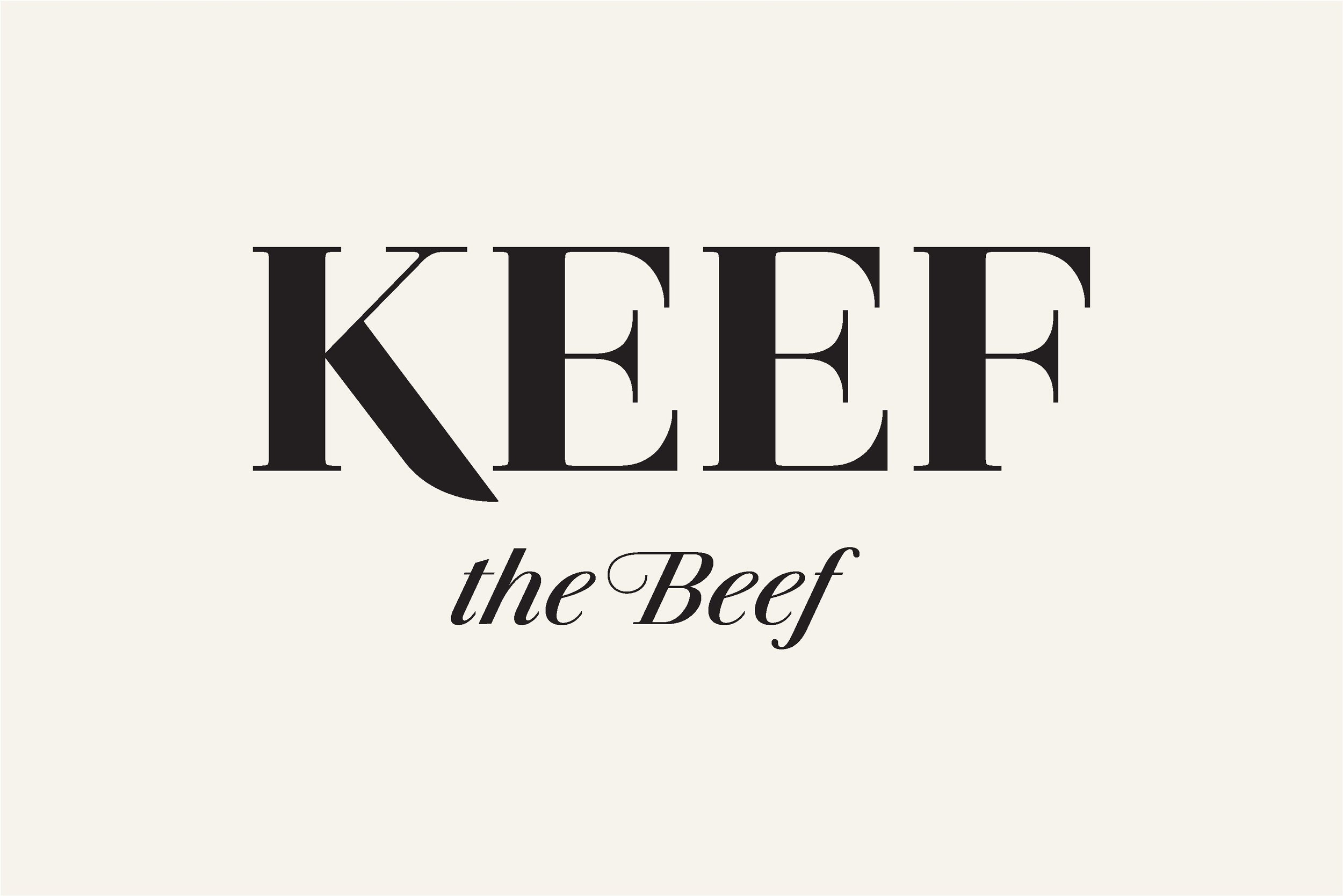
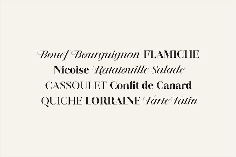
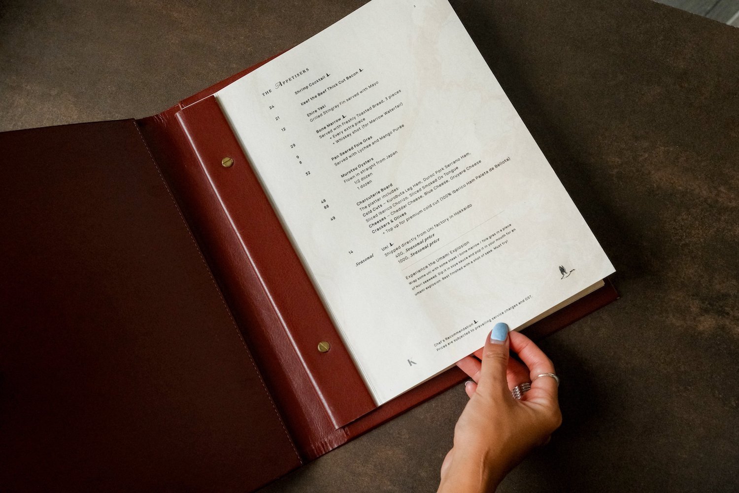
Jules Colossal is the main typeface for Keef the Beef. The font reflects the last of the late 18th century and was inspired by several plates from a Portuguese calligrapher named Antonio Jacintho de Araujo.

