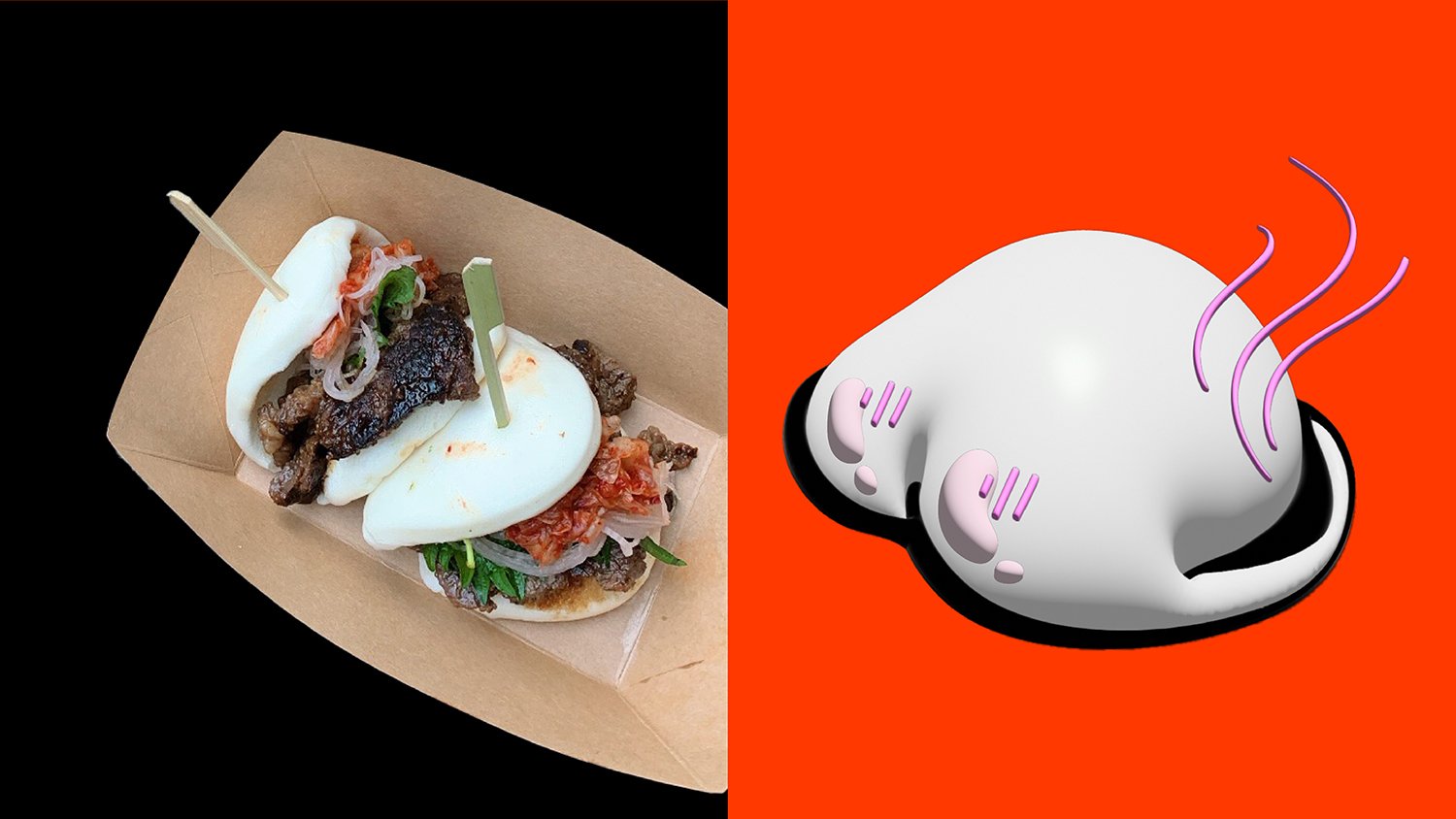
HotBuns
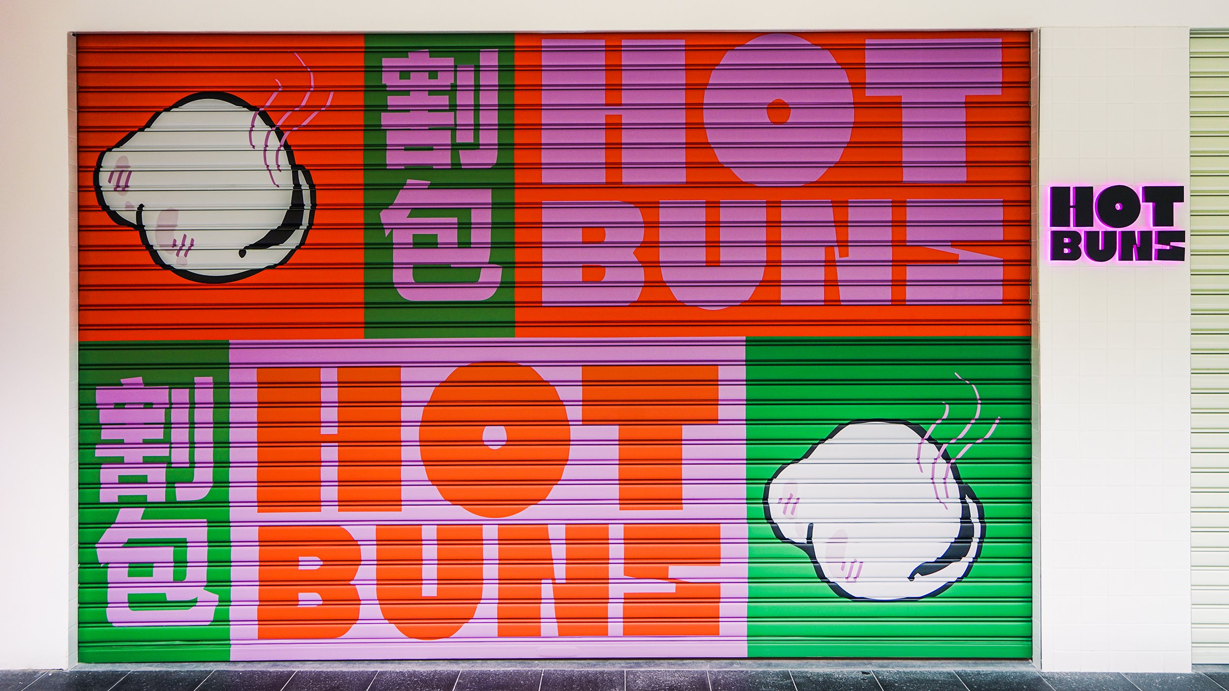
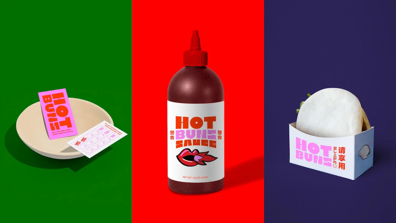
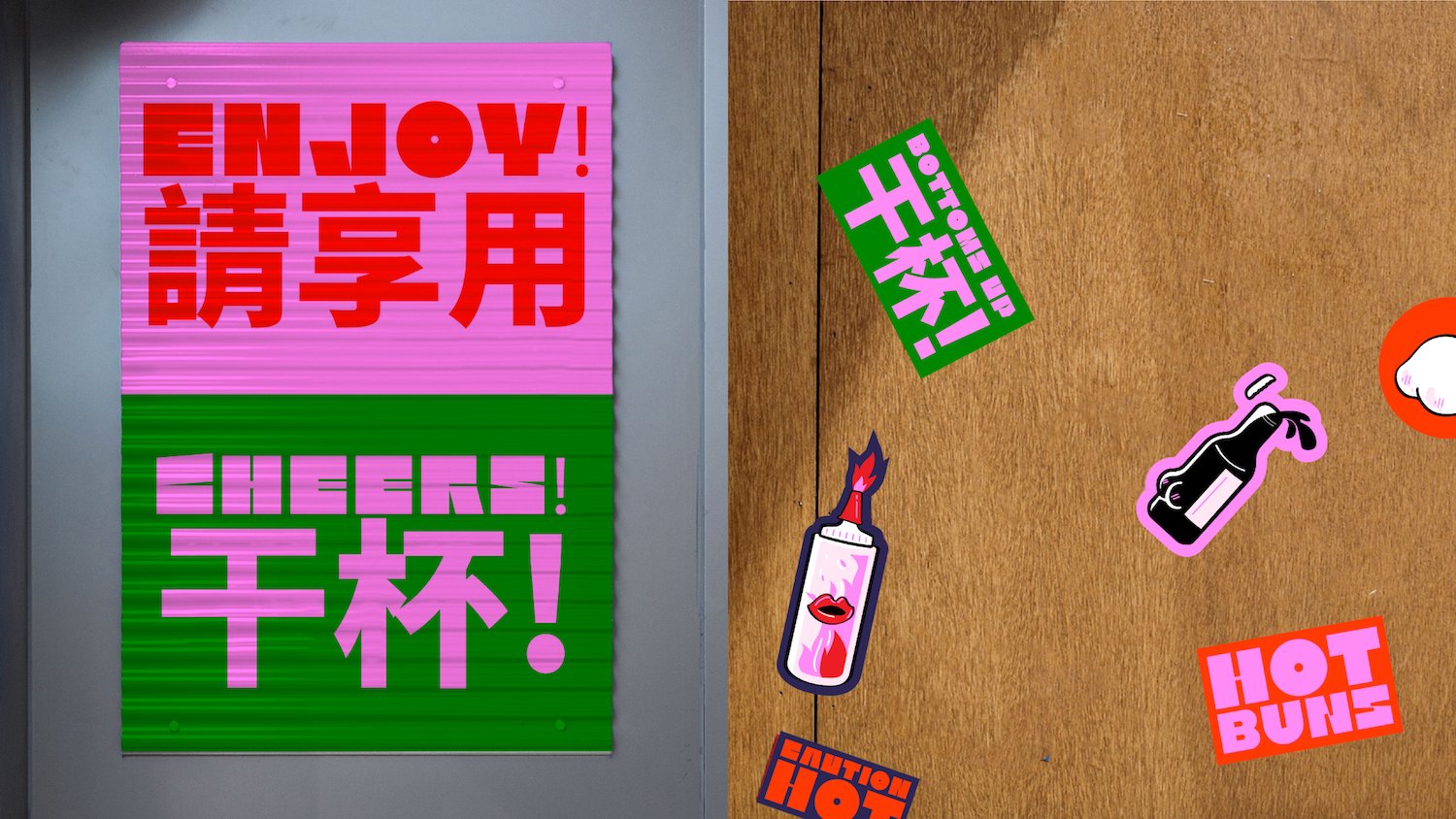
Meet HotBuns, a cheeky Grab-and-Go in Singapore's vibrant Clarke Quay. Not your typical guabao, focusing on south-east asian x chinese street food flavours for the local and international crowd. Friends of HotBuns includes slushlips (smoothies), hoppiness (beer) & hotstuff (hot sauce), to accompany the experience.
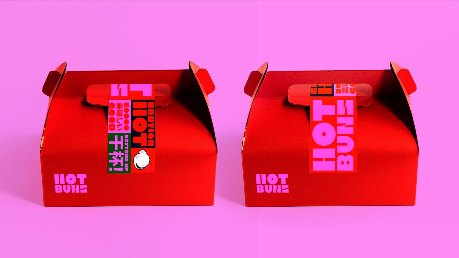
Inspired by the colourful street stalls in Asia, I wanted to give it a quirky and fun take by mixing bold fonts and colours. The main typeface for HotBuns is from Kiosk by Nguyen Gobber, and paired with Abordage Regular. The curves of the interiors and the shelving system was inspired by the curves of the HotBuns mascot.
Client
Red House Seafood
Year
2022
Discipline
Brand Identity, Environmental Graphics
Country
Singapore
Collaborations
Project undertaken at FARM
Mentions
feat. on FontsInUse