
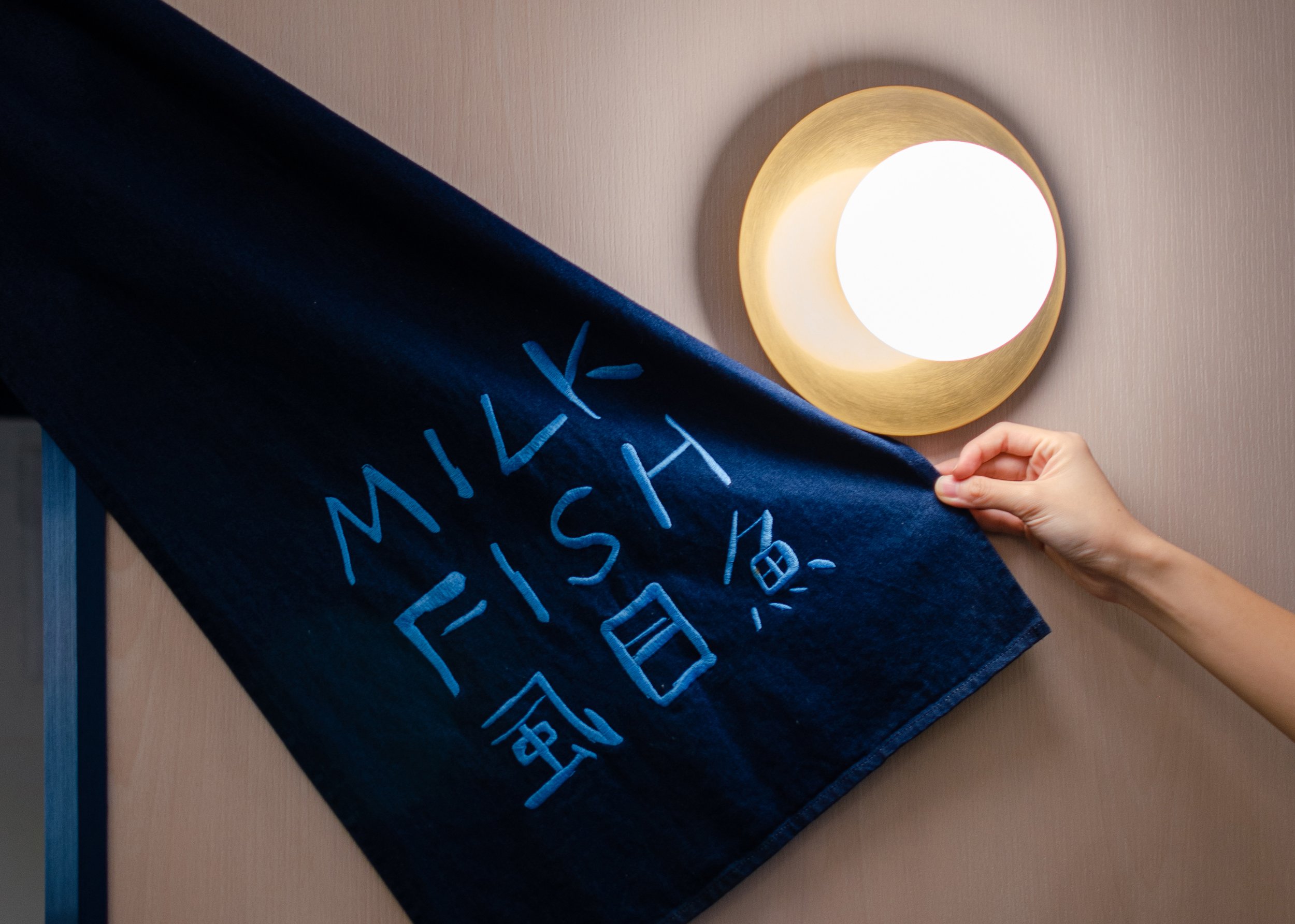
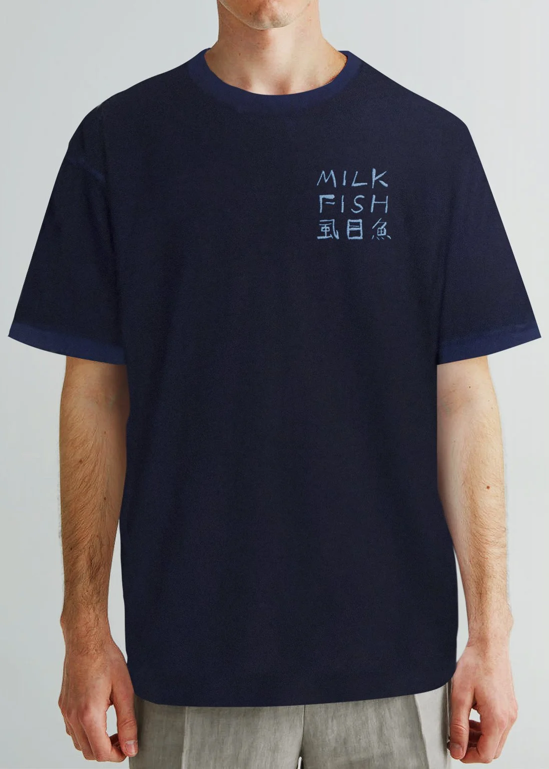
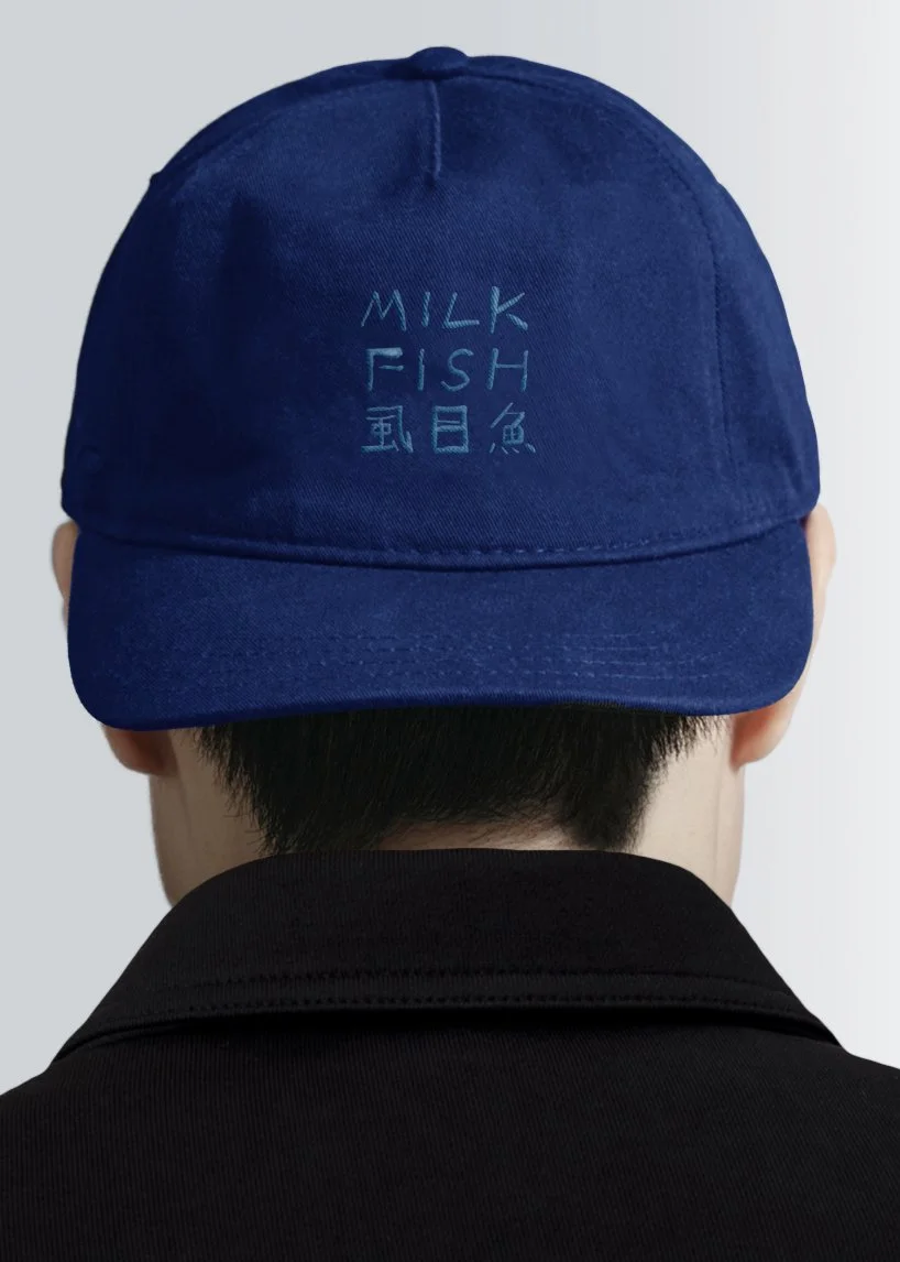
MilkFish
The visual and spatial identity for Milkfish was designed upon the act of slow brewing and distillation of their signature seafood broth. The fluid, textural qualities of the broth was assimilated into the logo, visualised in indigo ink and filmed to conjure the image of the flavourful emulsion.
The act of slow brewing the soup was assimilated into the logo, treated and filmed to conjure an image of the flavourful emulsion. The imagery used for the brand was meant to always remind patrons of the exceptionally silky and smooth texture of the soup.
Client
Red House Seafood
Year
2021
Discipline
Brand Identity, Coding
Country
Singapore
Collaborators
Project undertaken at FARM
Oh Wen Xin

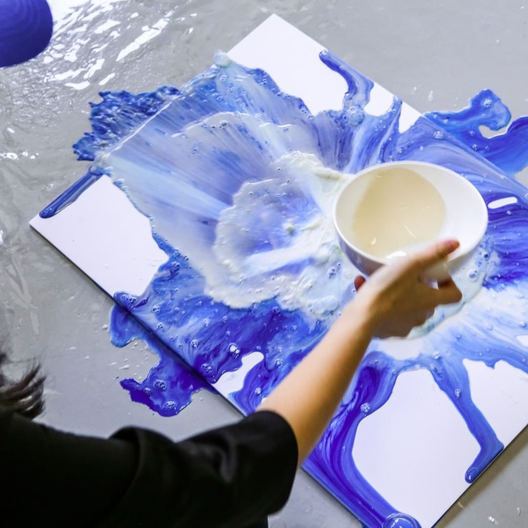
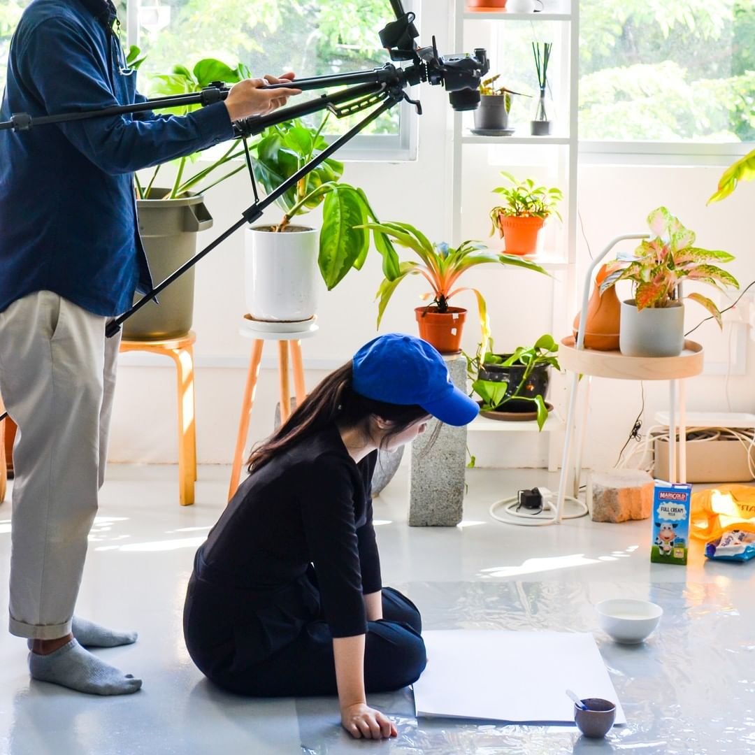
We created a typeface using indigo ink and the brand’s secondary elements by throwing milk over the inked logo. Simulating the way the meal is being prepared - the canvas as the pot, the ink as ingredients, and milk as the broth. With these elements, I manipulated them further using javascript to create an interactive element that could be used on the website.


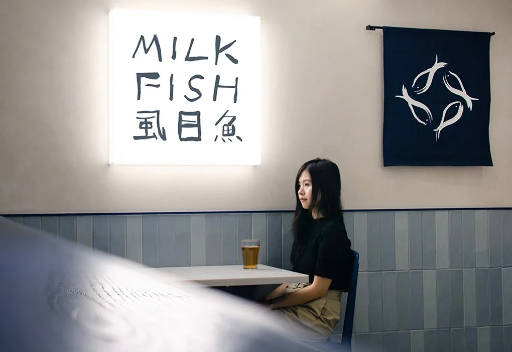
Inspired by the flavours of the sea, dynamic fish and seafood illustrations liven up a soothing interior palette of light wood and blue mosaic tiles.

